 |
| Welcome back! (detail from Yvain) |
I left off last week with sending the first dummy of the entire graphic novel to the publisher. Along with this dummy, I sent a package of concept sketches for the main „cast“ of characters and locations to show how I envisioned the rough thumbnail sketches of the book to come to life. Let's dive into that today:
 |
| opening view of part 2 of Yvain |
Part 2: Concept and Color for Yvain
While I was enjoying the script and working on first ideas for the pages of the book, in my sketch book I was taking notes about
the characters and who I thought they were. I also did a lot of research about the medieval world and the concept of the
"Minne" and what courteous behavior and relationships were supposed to be like. This helped me to understand the characters better and to figure out how I wanted to represent them:
 |
| Taking lots of notes about the characters and their world... |
 |
| … then noting down possibilities to distinguish them through forms of layout, design and color scheme... |
In connection to that I worked on the main
locations and what they should convey, based on the characters that lived there
and the scenes that took place there.
 |
| …at the same time working on location ideas: experimenting with different tree shapes for different locations (left), and first ideas for Laudine's castle (right) |
Both location and character design evolved together and one influenced the other. But to try to get some order into this post let me talk about one at a time:
Part 1: Characters - Using the theory of "The four Temperaments"
 |
| a line up of all important characters in the story |
To build the cast of characters I started out
with Yvain, for obvious reasons, and
pretty much instantly added Lunette and Laudine to the group of main characters. Both
of them are essential characters in Yvain’s world and shape his journey.
Lunette appears to me almost like a secret main character even because she is
pulling the strings in Yvain’s and Laudine’s story and she is fully aware of
it.
 |
| Lunette is manipulating Laudine – detail from Yvain |
I later added Gawain as Yvain’s best friend.
Gawain is not as present as any of the three others, but he plays an important
role in the book as a mirror to Yvain. In the beginning they both live the same life and have the same goals. Gawain shapes Yvain’s
journey by reminding him of the rules he has to follow to be seen as a
successful and brave knight.
 |
| Gawain is reminding Yvain of his duties as a knight – detail from Yvain |
Gawain is also important towards the end, when we see how Yvain has changed through his journey, while Gawain has stayed the same:
 |
| At the end of the story, Gawain is still the same – carefree and enjoying the feast – while Yvain is introspective and thoughtful – he has changed and now knows what is important to him. (detail from Yvain) |
So I had a foursome of main figures that I
wanted to have in the center of my cast and build the rest around. Now once
again – as with the slightly awe-inspiring thought that I would now have to come up
with sketches for a 128-graphic novel – I was searching for something to help me
put order to my thoughts and get started with designing the characters. For
this classic tale I thought it would be very fitting to look at a classic theory that was all the rage in medieval times: The theory of the 4 temperaments
that had been developed based on Hippocrates' theory of the
four humors:
 |
| a rough summary of the theory of the four humors (source) |
This theory had been used by writers starting
in ancient Greece to develop and distinguish characters (and if you look for it, you can still find it in more modern ensembles, think of
The Fantastic Four, The
A-Team, or The
Three Musceteers (plus Dartagnon) for
example). I wanted to try and use this theory as a starting point to develop
my characters:
Yvain and Gawain:
Yvain and Gawain start out very similar as
knights with the sole aim to find adventure and fame. They seem
carefree and unconcerned with the consequences of their actions. This fit very
well with the profile of the sanguine character. So I started out by designing
two more or less flighty characters, with upbeat positive and even slightly ignorant
demeanor.
Gawain I thought of as a sunny boy, a little reminiscent of the cliché of the surfer dude. He’s always looking to catch the next perfect wave, translate to catching the next epic fight:
 |
| first notes and sketches for Gawain |
Yvain at first goes along with this picture, but from the beginning there is an introspective side to him. I desiged him thinner, not as muscly as Gawain, and with very rigid hair and clothes at first. He is following the rules of his world and not quite clear yet about who he is:
 |
| first sketches of Yvain going through his transformation |
He then looses Laudine and goes through a time of madness, which pulls him down to earth and forces him to face the results his actions have brought:
 |
| Yvain before and during his madness |
This fit very well with the profile of the melancholic
character. His face gains character in the process of his journey. His clothes and hair become more individual due to the fact that they are
selfmade/selfcut from now on:
 |
| First color studies for Yvain before and after his madness... |
 |
| … and the final color studies for Yvain put together in one concept page. |
Laudine and Lunette:
Laudine and Lunette are contrasting characters
from the beginning, but they both show the ability to cope with loss, recognize
their responsibilites and the choices they have to make to protect them. They
both use the powers at their disposal to achieve these goals.
 |
| early sketches for Laudine in different moods and for different parts of the story |
Laudine carries her heart on her sleeve. She is
very passionate and outspoken about her grief in the beginning of the story,
and again in her rage towards the end. I wanted to underline this fiery
character with color and attributes such as her unruly hair and expressive
face. Like Yvain she changes throughout the story, guided (or forced) by Lunette's intrigues
to recognize that she needs to curb her temper and make pragmatic and sometimes
heartbreaking choices to rule her land and keep her people safe. I showed this
transformation by her change of clothes with a veil completely covering her
head and neck. Also her demeanor after coming to the decision to marry Yvain
changes. She becomes very reserved and does not show her emotions freely again
until the very end.
 |
| color studies for Laudine before and after Esclados' death |
Lunette is the enigma in this story, a sort of
mentor who guides and manipulates Yvain and Laudine, and never quite reveals
her own desires and intentions. She reminds me of the
Puck in English mythology (a famous example would be Puck in „
AMidsummernight’s Dream“), a sprite or fairy that is using her powers to cause
mischief or help, depending on her mood.
 |
| First sketches and notes for Lunette... |
I think it’s apparent that she wants
well for Yvain and Laudine. But it’s never quite clear why. She seems to like
Yvain for herself. But she willingly maneuvres to help him marry Laudine. There
seem to be political motives as well as personal ones, and lots of clever
planning in the background.
 |
| ...followed by color studies... |
To suggest Lunettes character I wanted to work with
blue shades in contrast to Laudines red ones. This color scheme also suggests
water, and night sky, hidden depths and fluidity. I gave her hair intricate loops to suggest the puzzle of her thoughts. Like
Gawain, Lunette doesn’t change throughout the story. But unlike him she is
aware of every aspect of it and of how her actions influence it.
 |
| … and the final design of Lunette in the book - detail from Yvain |
Overall the theory of the four temperaments served well as a starting point. Of course, not everything was a fit for my characters, and I completely ignored the body types that were suggested along with the dispositions. But it was interesting to have this theory to go from and figure out where it worked for me and where I had to move in a different direction.
Once I had these four main characters built up, I added the supporting characters and developed them to be distinctive from the main four yet compliment and contrast with the characters they interacted with:
 |
| Showing Laudine next to Lunette, Esclados and Yvain, to see how they would all work together. |
I am not going into detail on researching and designing clothes and armor here, for more information on that check out the illustrator's note at the end of the book.
Part 2: Locations - With some help from Animation Wisdom
In 2010 I went back to school and took a one
year intensive class in animation. One thought from my animation teacher stayed
with me especially: If you want the pose of a character to read instantly, the
silhouette has to read first. I wanted to
use this idea (once again, another starting point) for the main locations of
Yvain. For each of the castles I wanted a distinctive silhouette that lay underneath
the design and instantly communicated the atmosphere.
For example, for the Castle of Carlysle that Calogrenant
rides towards in the beginning of the story I wanted a rectangular shape, sitting
solidly in the landscape, to suggest a calm, happy and safe place Calogrenant
returns to after his misadventure. I had the idea of a sturdy steamship calmly
parting the rolling waves, and went from there to design the sprawling castle
sitting in rolling prosperous fields.
 |
| A first sketch of the castle Carlysle: a square shape reminiscent of a steam ship parting the seas... |
 |
| ...the color sketch for Carlysle... |
 |
| … and Carlysle in the graphic novel - detail from Yvain |
I found some beautiful reference for this castle in Britain, here are two examples:
For Laudine’s Castle, I wanted to take into
account the magic that is a part of her world. The weather stone brings
unimaginable storms to her forest and her castle on a regular basis. So she and
her people need to be protected as well as they can. Her castle sits high on a
cliff peak jutting out of the forest like a lighthouse, a beacon of hope:
 |
| The concept sketches for Laudine's castle. |
The
landscape with the flat dense forest and the sudden stone cliffs peaking out
seems not from this world. A few incredible places I had had the chance to visit came together in my mind here:
The dense forests and sudden stone cliffs of Saxon Switzerland inspired the landscape:
When thinking of the houses built into the sides of the cliffs, I was thinking of dwellings such as the ones in Canyon de Chelly in Arizona
or a more modern version in Setenil, Spain:
 |
| Houses built into the side of the mountain in Setenil, Spain (source) |
The
Castle in the Woods is more reminiscent of
a sturdy farmhouse than a castle, suggesting the rural farming community that
lives here. The people are protected by the surrounding forrest, and not used
to have to protect their land.
 |
| The color study for the castle in the woods... |
 |
| … and an example of a farm house I had in mind when starting with the design (source). |
I wanted the
Sweat Shop Castle to have a
forbidding and dangerous first impression. I had images from Ayers Rock in Australia in mind to show the strong and impenetrable quality:
 |
| Ayers Rock in Australia (source) |
At the same time I was thinking of a bear trap or a venus fly trap to hint at the danger hidden inside the castle:
 |
| Example of a bear trap… (source) |
 |
| ...and a Venus Fly Trap (source) |
During my research
I found pictures of medieval castle dwellings, that were built in a circle.
These were on a much smaller scale than the castle I designed, but the shape
was perfect for what I had in mind for this location in the story:
 |
| a first color study of the sweatshop castle |
Part 3: Pulling characters and locations
together into one world
 |
| Working on color ideas for characters and location on the same page, to see how they would work together. |
As these first ideas came together slowly an
overall picture of what the world would look like began to take shape. By
deciding on the different moods and atmospheres I wanted to achieve for each
location, and the different character traits I wanted to show on each
character, colors and details suggested themselves. Slowly, I developed a whole
living situation for different locations and used that background information
to design details such as coats of arms, colors and decoration details.
For example, at Laudine’s castle there are dwellings carved and built everywhere into the stone to afford the people protection from the storms. Because of the wild forest and the magic forces regularly wreaking hawoc, I decided that these people lived off of the hunt and what the forest had to offer them. I showed this in the colors they wear as well as the coat of arms and details of decoration:
 |
| The color concept for Laudine's castle, showing the impact of the storm as well as detail for decoration, armor, interiors etc. |
Another example is the sweatshop castle: Here I wanted to contrast the grey swamp like landscape and the ominous forbidding castle with the lavishness of the demon families' living quarters within. I also wanted to distinguish the colors of this place from all the others in the book, to suggest how removed from reality the family in this castle is:
 |
| The concept for Sweatshop Castle including lineup of characters, interior and exterior design of the castle, decoration details and details on the garden. The purple and gold hues are very different from the more natural colors used throughout the book. |
When putting together these concepts I included the characters as well to see how their designs and colors would fit with the surroundings I intended for them.
Of course, during this process of developing the characters and their homes, many ideas I was working on fell to the wayside. For example, in my early sketches i experimented with designs and shapes that were much more stylized. Below is a sketch of tree shapes that I worked on which suggested the pillars of a gothic cathedral or angular shapes echoing stone walls:
 |
| Experimenting with more stylized tree shapes for each location. |
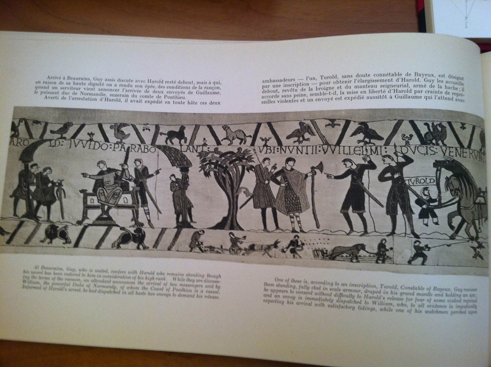
This thought came from researching art and artifacts from the 12th century. I loved how the art was very stylized, formulaic even in depicting items or locations, so they were easily recognizable:
 |
| Studying the Bayeux Tapetry: note the stylized tree shape in the middle of the page |
However, as my ideas for color and design came together I realized that I wanted the reader to feel as close as possible to the characters and their world. More stylized designs would not have helped here, they would have broadened the gap that was already looming through the fact that this ballad is centuries old. I wanted this story to touch the reader in the here and now, and at the same time keep some of the qualities of the beautiful medieval art I had seen. Therefore I focused on conveying the atmosphere of the places through more realistic and natural shapes and colors, but tried to keep the rich and intricate nature of the tapestries and illuminated scripts in my mind when going to final art (more on that in Post 3):
 |
| Color studies for the most important forest locations. |
But, as I already mentioned, the process of sketching for the pages of the graphic novel and working on the design for characters and places went hand in hand. So ideas I had for one side of the process sometimes resurfaced in different form on another side of the process. One example is the idea of the tapestries:
While I was sketching the thumbnails for the pages of the graphic novel I found three scenes where a character tells a story within the story. There are endless possibilities to show this in graphic novels, for example a different type of frame, or color scheme, or drawing style … . I wanted the reader to stay with the characters though, and found that tapestries would be the perfect way to visualize the telling of the story without leaving the character that is talking. The reader feels like he is in the room with the characters, listening to the story being told. This, I felt, even added to the realistic feel of the rest of the graphic novel and allowed me to pay homage to the beautiful art from that time:
 |
| The master of the castle in the woods tells the story of Harpin. The images on the tapestries behind him visualize the same story. |
 |
| The slave girls weave and stitch their own story of being abducted to work for the demons. |
(For more information about tapestries and how they were used in the middle ages, check out the illustrator's note at the end of the graphic novel.)
Finally, I had the dummy for the graphic novel and an accompanying package of first designs for characters and locations put together. Time to send everything off to the art director and start a conversation about where the graphic novel was developing. Now there was a period of going back and forth, discussing, adjusting and fine-tuning, until finally we were ready to go to
Part 3: The Final Art
…but more on that next week!
 |
| See you next week! (detail from Yvain) |


2 Comments:
Ich liebe deine Bilder über alles! Danke für die superinteressante und detaillierte Beschreibung des Arbeits- und Entstehungsprozesses! Wirklich spannend! lg Romi :-)
Vielen Dank Romi!
Post a Comment
<< Home